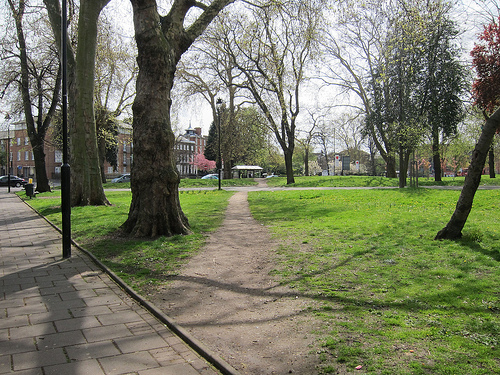
Imagine a university quad. The grass is a beautiful emerald green but, in a few places, it’s been beaten down to the dirt in straight smooth lines. These dirt paths, not the brick walkways, are the fastest way to get from point A to point B.
Similarly, at Pokeit, we have been using your feedback to cut direct paths to the most important parts of the app. Here are some of the changes we’ve made for this new version 3.4.1 release:
- The settings panel now opens directly to the presentation section while viewing a loaded visualization. Here you can add, remove and rearrange your fields and change the grouping of your visualization. The filters section is now one click away as are all the advanced options available to you before;
- We have also simplified the filters section, making it easier to find new filters to add to your visualizations. Just start typing and matching options will appear on the screen. There’s now a dedicated section called the Filter Workspace, which is shared across all open visualizations so you don’t have to add the same filter twice;
- You can now “favorite” visualizations either from the dashboard or from the save dialog. Favorited visualizations appear at the top of the dashboard giving you easy access to the views you use most; and
- We’ve improved Hand Browser load times dramatically so you don’t have to wait as long to see your most recent hands
Check out our changelog to find out more about these changes. For our next update, we’ll be adding the Winning Poker Network to Pokeit’s comprehensive list of supported sites.
Thanks,
The Pokeit Team
cc image by Alan Stanton http://flic.kr/p/bNU5cF